Table of Contents
Discrete Structures Fall 2020 Status
Data and visualizations generated from class activity.
This information is provided to give you a better perspective on how the class as a whole is trending.
Numeric Stats on Deliverables
================================================================================================================
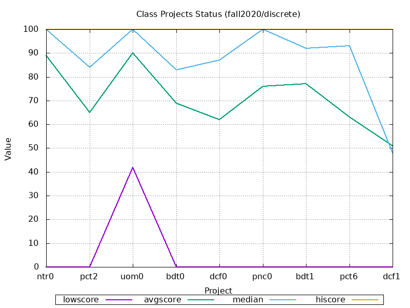
DISCRETE  ntr0 pct2 uom0 bdt0 dcf0 pnc0 bdt1 pct6 dcf1  got+bns/totl tlly prjct+prtcp+jrnal=results ( grade )
================================================================================================================
 lowscore:   0    0   42    0    0    0    0    0    0 .............   4% ......................... ( 14.748)
 avgscore:  89   65   90   69   62   76   77   63   51 .............  92% ......................... ( 53.460)
   median: 100   84  100   83   87  100   92   93   48 .............  46% ......................... ( 91.404)
  hiscore: 100  100  100  100  100  100  100  100  100 ............. 148% ......................... (131.787)
     mode: 100  100  100  100  100  100  100  100    0
    range: 100  100   58  100  100  100  100  100  100
================================================================================================================
 # passed:  11    8   11    9    8    9   10    8    5 .............   10 ......................... 10 ( 83%)
  # of As:   8    4    8    6    6    8    5    6    4 .............    5 .........................  6 ( 50%)
  # of Bs:   3    3    2    0    0    1    5    1    1 .............    4 .........................  2 ( 16%)
  # of Cs:   0    1    1    3    1    0    0    1    0 .............    1 .........................  2 ( 16%)
  # of Ds:   0    0    0    0    1    0    0    0    0 .............    0 .........................  0 (  0%)
  # of Fs:   1    4    1    3    4    3    2    4    7 .............    2 .........................  2 ( 16%)
 # submit:  15   11   14   12   10   10   10    8    8
  # early:  14    5    7    6    4    4    3    6    2
  # onday:   1    4    4    3    4    6    6    2    4
   # late:   1    2    3    3    2    1    1    1    2
# missing:   2    5    2    3    5    4    4    6    6
 % passed:  91%  66%  91%  75%  66%  75%  83%  66%  41%
  % of As:  66%  33%  66%  50%  50%  66%  41%  50%  33%
  % of Bs:  25%  25%  16%   0%   0%   8%  41%   8%   8%
  % of Cs:   0%   8%   8%  25%   8%   0%   0%   8%   0%
  % of Ds:   0%   0%   0%   0%   8%   0%   0%   0%   0%
  % of Fs:   8%  33%   8%  25%  33%  25%  16%  33%  58%
 % submit: 125%  91% 116% 100%  83%  83%  83%  66%  66%
  % early: 116%  41%  58%  50%  33%  33%  25%  50%  16%
  % onday:   8%  33%  33%  25%  33%  50%  50%  16%  33%
   % late:   8%  16%  25%  25%  16%   8%   8%   8%  16%
% missing:  16%  41%  16%  25%  41%  33%  33%  50%  50%
================================================================================================================
Class Project Progress
Of the various all-class metrics we can analyze:
- low score
- average score
- median score
- high score
- submission rate
- late/missing rate
We can visualize the results to gain a big picture view. The more the data stays within a certain range, the less interesting the graphs will appear. In such cases, boring graphs indicate the class as a whole is staying relatively the same with respect to that metric (dips would tend to indicate problems, rises would tend to indicate improvements).

