−Table of Contents
Data Structures Fall 2019 Status
Data and visualizations generated from class activity.
This information is provided to give you a better perspective on how the class as a whole is trending.
Numeric Stats on Deliverables
====================================================================================================================================
DATA      dsi0 pct1 ael0 pct2 sln0 pct3 sln1 pct4 sll0 pct5 sll1 pct6 sll2  got+bns/totl tlly prjct+prtcp+jrnal=results ( grade )
====================================================================================================================================
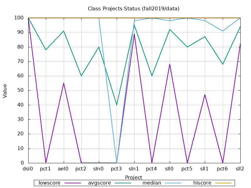
 lowscore: 100    0   55    0    0    0   89    0   68    0   47    0   82 .............  52% ......................... ( 91.519)
 avgscore: 100   78   91   60   80   40   95   60   92   80   87   68   94 ............. 133% ......................... ( 29.040)
   median: 100  100  100  100  100    0   98  100   98  100   98   91  100 ............. 136% ......................... (114.025)
  hiscore: 100  100  100  100  100  100  100  100  100  100  100  100  100 ............. 150% ......................... (134.552)
     mode: 100  100  100  100  100    0   98  100  100  100  100  100  100
    range:   0  100   45  100  100  100   11  100   32  100   53  100   18
====================================================================================================================================
 # passed:   5    4    4    3    4    2    5    3    5    4    4    3    5 .............    5 .........................  5 (100%)
  # of As:   5    3    4    3    4    2    4    3    4    4    4    2    3 .............    5 .........................  4 ( 80%)
  # of Bs:   0    1    0    0    0    0    1    0    0    0    0    1    2 .............    0 .........................  1 ( 20%)
  # of Cs:   0    0    0    0    0    0    0    0    1    0    0    0    0 .............    0 .........................  0 (  0%)
  # of Ds:   0    0    0    0    0    0    0    0    0    0    0    0    0 .............    0 .........................  0 (  0%)
  # of Fs:   0    1    1    2    1    3    0    2    0    1    1    2    0 .............    0 .........................  0 (  0%)
 # submit:  10    6    6    5    6    3    5    6    6    6    5    6    5
  # early:   6    2    4    1    1    1    3    2    3    3    2    4    2
  # onday:   1    4    2    3    5    2    2    4    2    3    3    1    3
   # late:   1    1    1    1    1    1    1    1    1    1    1    1    1
# missing:   1    1    1    2    1    4    2    1    1    1    2    1    2
 % passed: 100%  80%  80%  60%  80%  40% 100%  60% 100%  80%  80%  60% 100%
  % of As: 100%  60%  80%  60%  80%  40%  80%  60%  80%  80%  80%  40%  60%
  % of Bs:   0%  20%   0%   0%   0%   0%  20%   0%   0%   0%   0%  20%  40%
  % of Cs:   0%   0%   0%   0%   0%   0%   0%   0%  20%   0%   0%   0%   0%
  % of Ds:   0%   0%   0%   0%   0%   0%   0%   0%   0%   0%   0%   0%   0%
  % of Fs:   0%  20%  20%  40%  20%  60%   0%  40%   0%  20%  20%  40%   0%
 % submit: 200% 120% 120% 100% 120%  60% 100% 120% 120% 120% 100% 120% 100%
  % early: 120%  40%  80%  20%  20%  20%  60%  40%  60%  60%  40%  80%  40%
  % onday:  20%  80%  40%  60% 100%  40%  40%  80%  40%  60%  60%  20%  60%
   % late:  20%  20%  20%  20%  20%  20%  20%  20%  20%  20%  20%  20%  20%
% missing:  20%  20%  20%  40%  20%  80%  40%  20%  20%  20%  40%  20%  40%
====================================================================================================================================
Class Project Progress
Of the various all-class metrics we can analyze:
- low score
- average score
- median score
- high score
- submission rate
- late/missing rate
We can visualize the results to gain a big picture view. The more the data stays within a certain range, the less interesting the graphs will appear. In such cases, boring graphs indicate the class as a whole is staying relatively the same with respect to that metric (dips would tend to indicate problems, rises would tend to indicate improvements).

